Guides
How to Choose a Room Color Palette You Will Actually Love
Renderist Team ·
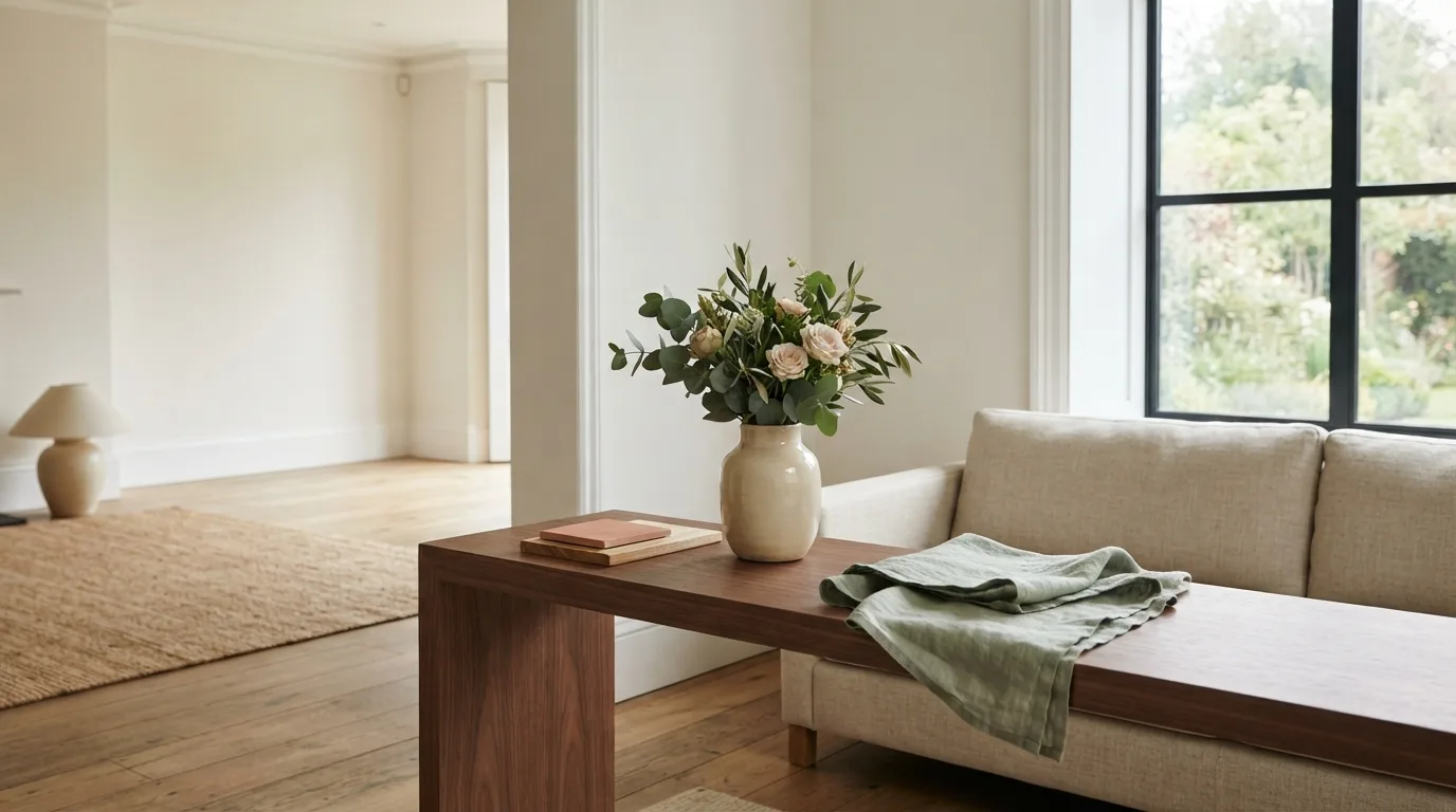
What Makes a Living Room Color Palette So Hard to Settle On?
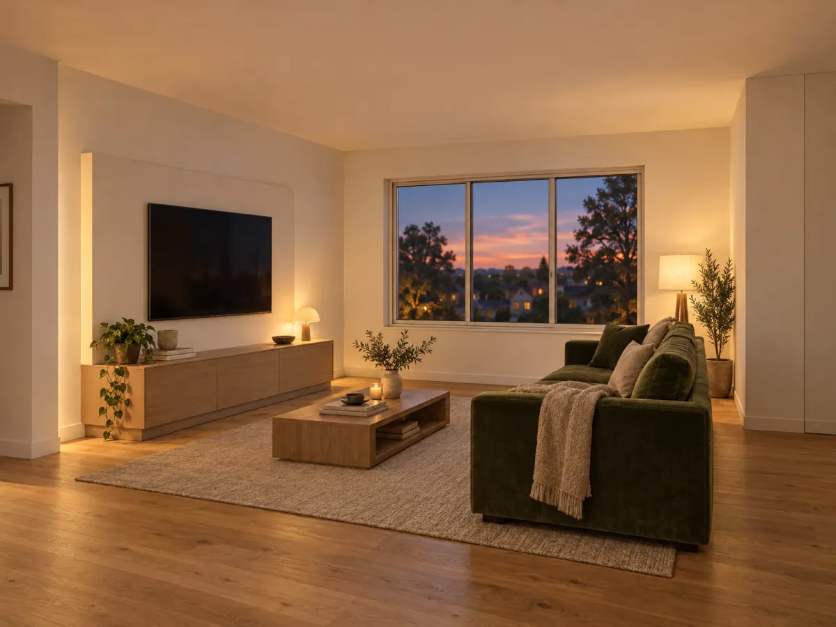
Settling on a room color palette is hard because the living room is usually the largest space you have to decorate, as Architectural Digest notes, and every wall you paint is a decision you see daily. The fix is to stop picking a favorite color and start picking a job for each color. Start with the mood you want, not the shade. Warm tones build a lively, cozy atmosphere and cool colors bring a serene, calming one, so the palette should match the feeling you want in the room. A kitchen can take vibrant colors that boost energy and appetite, while a bedroom needs soothing tones that help you relax. Light decides how paint colors actually read. Natural, fluorescent and incandescent light each change how a color looks, which is why Architectural Digest advises seeing a shade in your own room before you buy the roller. Watch the walls through the day: a shade that looks charmingly bright in morning sun can feel overbearing under the evening glow. Your furniture sets the limits. Existing furniture, curtains and decor should shape the choice so the walls highlight those pieces instead of overpowering them. A soft neutral, like the warm whites and pale straws designers pair with natural materials, gives bold chairs and sofas room to speak.How Does Light Change the Way a Room Color Palette Looks?
A wall you painted last summer can look like a different color by evening. Natural, fluorescent and incandescent light each change how paint colors read, as Architectural Digest notes, which is why the same swatch can feel right in the store and wrong at home. Watch one wall through a full day before you commit. A shade that looks charmingly bright in morning sun may feel overbearing under the evening glow. Shadows matter too: they darken light colors, dull bright ones, and hide flaws far better on dark walls than on pale ones. That is the argument for testing paint colors in your own room instead of judging from a fan deck. North-facing rooms pull cool and gray; south-facing ones warm everything up. A neutral beige can turn peachy in one and flat in another. White paint colors are the hardest to call. A pure white with no undertone can read clinical in low light, while a soft warm white holds its footing. If you want a green that stays calm, pick an earthy one and check it under your own bulbs before the roller comes out. Renderist lets you drop a palette onto a photo of your actual room and see it under different light settings before you buy a sample pot.Should You Start With Neutrals or a Bolder Room Color Palette?
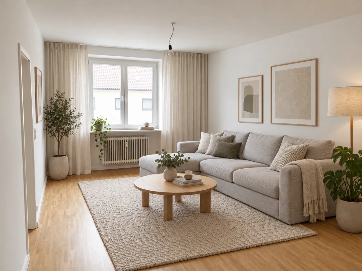
Neutrals are the safer starting point, and the research backs that up. In a study of virtual bedroom spaces published in DEPARCH Journal of Design Planning and Aesthetics Research, participants rated neutral walls more positively than warm or cool ones. If you want a room you will not tire of, a neutral color palette gives you that room. That does not mean beige everywhere and nothing else. Neutrals such as grays, beiges and whites give a room a sense of balance and grounding, so they hold the space while your furniture, art and textiles do the talking. A warm white with subtle yellow undertones, like Sherwin Williams Simply White, sits well with warm palettes and natural materials. Bolder choices earn their place when the room has a job to do. A kitchen can take vibrant paint colors that lift energy and appetite, while a bedroom needs soothing tones that help you relax. A deep earthy green can make a small nook feel like an extension of the garden outside. One caution before you commit to rich colors. The same shade can feel energizing in one setting and overwhelming in another, because your brain ties color to feelings and memories. Test the palette in your own room, under your own light, before you buy the paint.How Do You Match a Color Palette to the Room's Purpose?
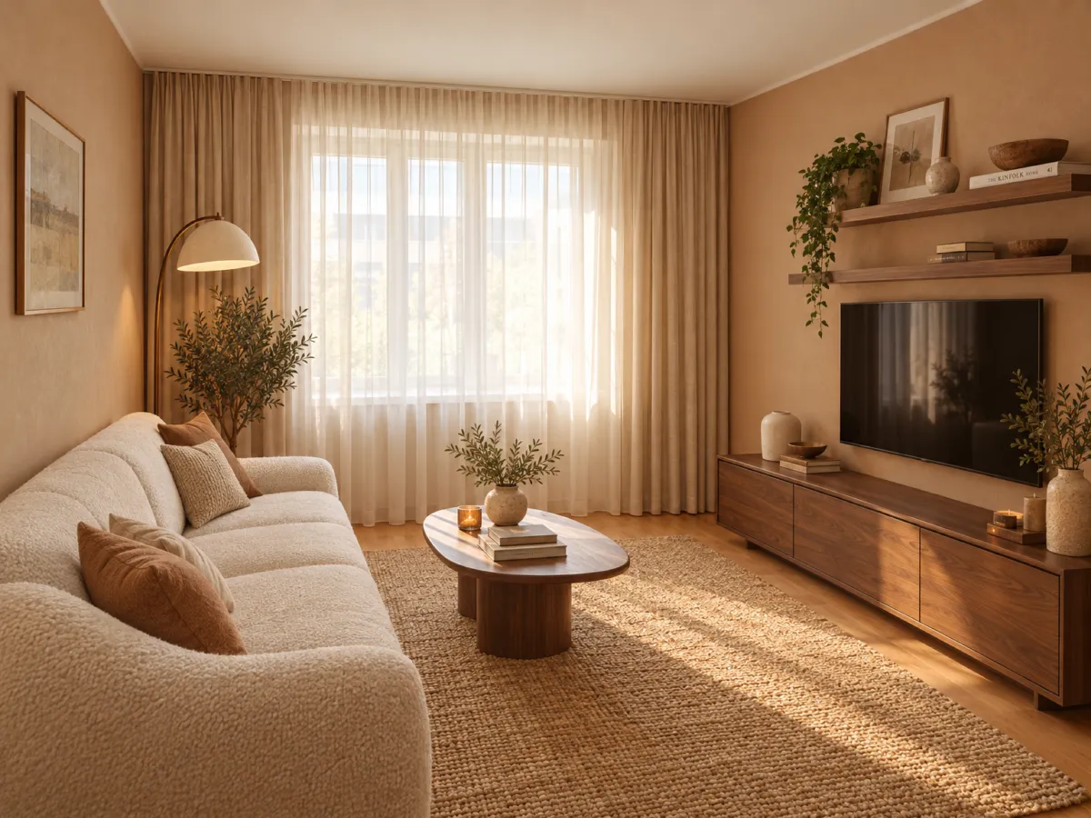
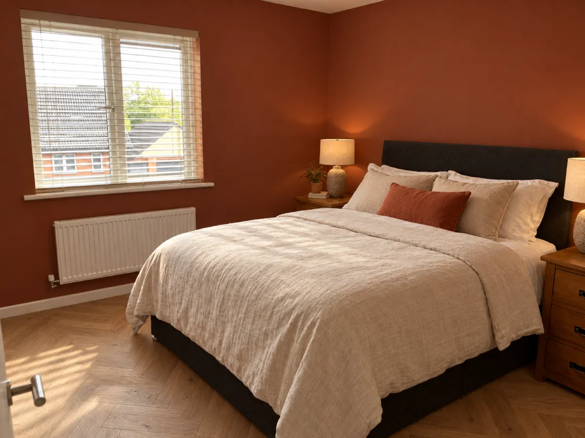
A bedroom needs soothing tones that help you relax, while a kitchen can take vibrant colors that boost energy and appetite. Start with what happens in the room, then let the color scheme follow that job. For a bedroom, blues and greens are often recommended because they bring a sense of calm. A study in DEPARCH Journal of Design Planning and Aesthetics Research tested virtual bedrooms in neutral, warm and cool versions and found neutral walls were generally rated more positively than warm or cool ones. The same study found men, engineers and people aged 25-35 rated bedroom schemes more favorably than architects, interior designers, women and people aged 36-50, so no single palette suits every eye. Living rooms and open-plan areas take earthy neutrals with soft terracotta, browns and rusts, which read as warm and stable. A cozy palette built on those tones gives you a background that furniture can sit against instead of fighting. Where you want drama, go deeper. Moody tones such as a deep earthy green can make a small nook feel like an extension of the garden outside. A delicate pastel pink, like the one used in a Nashville living room, can balance bold mustard yellow chairs and sapphire blue sofas without turning the room into a showroom. A vintage blue or a soft green works in a reading corner for the same reason it works in a bedroom: it slows the room down. Match the palette to the mood you want before you match it to a trend.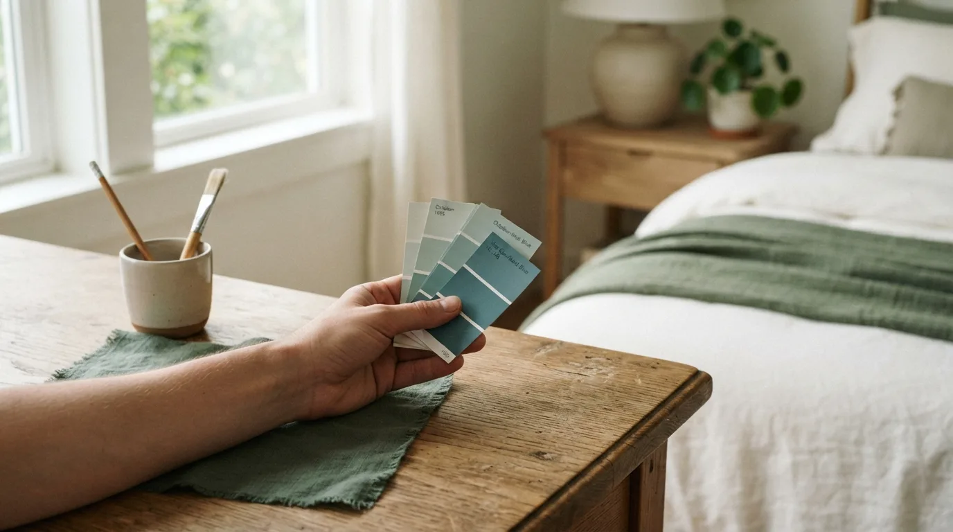
How Do You Turn Paint Chips Into a Room Color Palette You Can Trust?
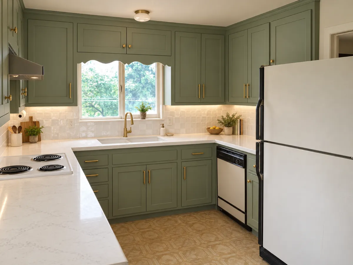
Start with the biggest surface, not the chip you liked most. A living room is usually the largest space in a home to decorate, which is why settling on its paint color feels so hard, as Architectural Digest notes. Paint the walls first, then let the trim, ceiling and furniture follow. Before you commit, watch how daylight moves through the room. A shade that looks bright in the morning can feel heavy by evening, so check it at several hours of the day. Natural, fluorescent and incandescent light each change how paint colors read, which is why Architectural Digest suggests seeing a color in your own space before you open the can. Your existing pieces should drive the choice. Furniture, curtains and decor work best when the walls highlight them instead of drowning them out. A delicate pastel can balance bold seating the way Farrow & Ball Middleton Pink offsets mustard and sapphire sofas, and a deep earthy tone such as Benjamin Moore Peale Green can make a small nook feel like part of the garden. For a neutral color palette, look at the undertone rather than the name. A white paint with subtle yellow undertones, like Sherwin Williams Simply White, sits well with warm schemes and natural materials, while a light neutral inspired by pale straw, such as Farrow & Ball Matchstick, brings warmth without taking over. Greens earn their place for a reason. A forest green reads calm and grounded, and a softer sage green suits bedrooms and reading corners where you want to unwind. If you want to test a full room color palette before buying, upload a photo of your room to Renderist and swap shades on your own walls first.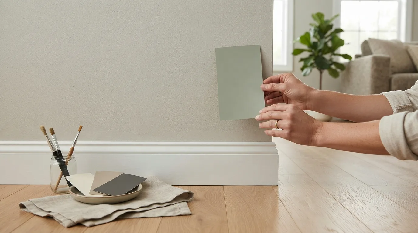
How Can You Test a Room Color Palette Before You Paint?
Light decides more than the swatch does. According to Architectural Digest, natural, fluorescent and incandescent light each shift how interior paint reads, so a shade that looks right in the store can fall flat at home. Watch the room through a full day before you commit: a color that feels bright in the morning can turn heavy by evening. Shadows do their own work on top of that. They pull light colors darker and dull bright ones, while dark colors hide wall imperfections that pale shades expose. That is why a neutral color palette tested at noon tells you almost nothing about how the same wall behaves under a lamp. Start with what stays in the room. Furniture, curtains and decor should shape the palette, so the walls highlight those pieces instead of fighting them. Pull the green out of a rug or the gray tones from a sofa, and you have a palette that already belongs in the space. Then test it cheaply. Tape swatches to the wall, look at them morning and night, and compare a few palettes side by side rather than one at a time. If you want to see a whole room change first, photograph the space and try the colors on the image in Renderist before you buy a sample pot. Warm tones against natural wood tones, or a soft neutral against ground tones, are easier to judge on a full wall than on a two-inch chip.Najczęściej zadawane pytania
What colors make a bedroom feel calm?
Blues and greens are the usual pick for bedrooms, reading nooks and other quiet spaces because they help lower heart rate and bring a sense of calm. A study of virtual bedrooms in the DEPARCH Journal of Design Planning and Aesthetics Research also found that neutral wall colors were rated more positively than warm or cool ones. If you want the room to feel restful, keep the strongest color for bedding or art and leave the walls softer.
Do men and women judge room colors differently?
In that bedroom study, men rated the color schemes more favorably than women, and people aged 25-35 rated them more favorably than people aged 36-50. Architects and interior designers were also tougher judges than engineers and other professionals. Treat this as a reminder that your own reaction matters more than a general rule, and check the palette with everyone who lives in the room.
How do I stop a bold color from taking over the room?
Give the bold color one clear job and keep the rest of the palette quiet. A delicate pastel pink can offset mustard yellow chairs and sapphire blue sofas, and a warm neutral inspired by pale straw creates a welcoming mood without dominating the space. Existing furniture, curtains and decor should shape the choice so the walls highlight those pieces instead of overpowering them.